You might not realize it, but all sorts of companies have developed all sorts of tactics meant to encourage you to take out that credit card.
What do they know that we don't? The corporate powers that be have long recognized that human beings are not rational creatures, but rather emotional beings that can be easily manipulated without notice. And unfortunately, that's especially true when you're shopping.
So exactly how are you getting played? We took a look at all the hidden messages, subtle design changes and special music that shops use to trick you into spending more.
1. Heineken and Amazon have subliminal smiley faces in their logos so you feel happier about the brands
![brand smiles]()
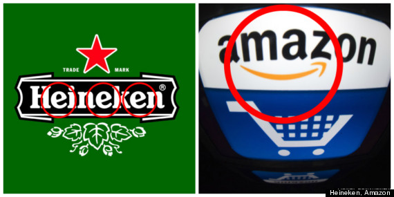
You may not notice it, but the three e’s in Heineken are designed to look like they're smiling, John Clarke, the director of global external communication for the company, told The Huffington Post in an email. The happy faces give a "friendlier appearance," he said. Similarly, the yellow arrow linking the A to Z in Amazon was created by design agency Turner Duckworth to look like a smiling face so that e-commerce giant will "benefit from feeling a little more human," according to the agency's website.
Clarke referenced an explanation about the e's in the Heineken logo that Freddy Heineken, the grandson of the company's founder who would later become the chairman and CEO, gave in 1958 when the beer's design was changed:
"If we make them smile, we look so much friendlier."
2. Cereals and other brands use human-like mascots to make you feel like you know the product
![cereal mascots]()
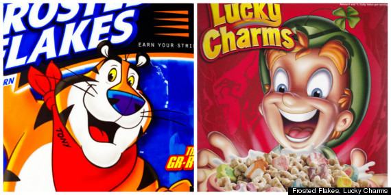
What do a gregarious tiger or a spunky leprechaun have to do with your breakfast? Absolutely nothing, but research has found that we form emotional attachments when brands are anthropomorphized with characters. You’re not buying cereal (or toilet paper, tires, insurance, etc.), you’re buying a friend!
"They help define the brand and often reinforce key aspects of products, and help give the brand a personality," Mike Siemienas, manager of brand media relations at General Mills, which makes Lucky Charms, told HuffPost when asked about the strategy behind the use of mascots.
3. Similarly, characters on cereal boxes gaze downwards to make eye contact with children
![trix]()
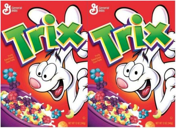
According to a recent study by Cornell University's Food and Brand Lab, two-thirds of the characters on the boxes for popular children's cereal brands look downwards. The characters are effectively making eye contact with small children in the aisles of supermarkets to amplify loyalty to the brand, according to the researchers.
The team asked research participants to look at two boxes of Trix -- one with the rabbit looking down and one with it looking straight out. They found that so-called "brand trust" rose by 16 percent and "feeling of connection to the brand" increased by 28 percent when people were looking at the version where the rabbit made eye contact.
4. IHOP redesigned its menu to make you order more
![ihop]()
Before and After
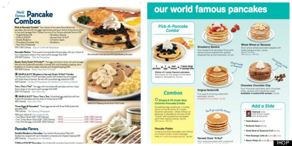
IHOP recently realized that it could do better when it came to its menus, which were confusing and crowded. The chain redesigned its menu to make it clearer, using mouth-watering pictures, boxes and color-coded categories.
The idea was to create a menu that's easier for customers to digest, which can get people to order more food, according to a recent Bloomberg video. Apparently, the strategy is working: The dining chain has seen a boost in sales since June 2013.
5. Bloomingdale's and other stores use specific smells to inspire you to spend
![bloomingdales shopping]()
Ever noticed that malls smell like cinnamon sticks right around the holidays? Turns out that a pleasant smell can help get you to spend more -- and come back to spend again. Bloomingdale's intentionally has the smell of coconut in the swimwear section, Time reported in 2013, and stores like Hugo Boss turn to professional companies to provide signature scents for their brands.
6. Supermarkets put fruits and vegetables up front to coax you into buying junk food later
![supermarket produce america]()
It's no coincidence that you begin your shopping experience in the produce section of virtually every supermarket. It's designed that way so you enter the store feeling good about your healthy purchases and don't feel as bad buying all those cookies, chips and bottles of soda later.
7. J.C. Penney jacked up prices so that it seemed like customers were getting a big sale discount
![jc penney discount]()
Last year, Reuters confirmed that J.C. Penney was using a strategy called "mark-up to mark down" to lure shoppers and boost sales. And yes, the tactic was exactly what it sounds like: The chain falsely inflated the prices of items and then lowered them through sales and discounts to make those "bargains" look just a little bit better.
8. Apple waits to send you receipts from iTunes downloads so that you don't feel bad about your impulse purchase of that new Iggy Azalea track
![itunes]()
Ever immediately regret an impulse buy you make online? Apple reduces that guilt by simply delaying sending you receipts for an iTunes or App Store purchase by a couple hours or days, according to Wired. Sneaky!
9. Bars and restaurants won't include the dollar sign so you'll forget you're spending
![no dollar sign menu]()
Research from Cornell's School of Hotel Administration found that people dining out spend more money when the price is not accompanied by a dollar sign in front of it.
10. Stores will hook you by letting you touch things before you buy
![napoleon dynamite tupperware]()
A 2010 study by economists at California Institute of Technology found that shoppers will pay up to 50 percent more for goods if they can touch them ahead of time. So while online shopping may be more convenient, you’ll fork over more money for something if you have direct contact with it in a traditional store.
11. Stores will play slow music to get you to linger inside and form emotional attachments with brands
![pregnant woman shopping]()
One Asian mall saw an uptick in purchases by pregnant women after it "started playing soothing music from the era when these women were born," marketing expert Martin Lindstrom wrote in his book Brandwashed: Tricks Companies Use to Manipulate Our Minds and Persuade Us to Buy. And, according to Lindstrom, the women said the mall's music continued to have a calming effect on their children even after they were born.
Another study in Scotland found that diners at a restaurant spent more money when slow music was playing, as opposed to fast music. This might be why Starbucks plays jazz and grocery stores play that slow elevator music.
12. Up-tempo songs encourage fast shopping and impulse buys
![drake dance]()
Meanwhile, playing fast, up-tempo music will make people go through stores quickly and make impulse buys, according to one study published in the European Journal of Scientific Research.
What do they know that we don't? The corporate powers that be have long recognized that human beings are not rational creatures, but rather emotional beings that can be easily manipulated without notice. And unfortunately, that's especially true when you're shopping.
So exactly how are you getting played? We took a look at all the hidden messages, subtle design changes and special music that shops use to trick you into spending more.
1. Heineken and Amazon have subliminal smiley faces in their logos so you feel happier about the brands
You may not notice it, but the three e’s in Heineken are designed to look like they're smiling, John Clarke, the director of global external communication for the company, told The Huffington Post in an email. The happy faces give a "friendlier appearance," he said. Similarly, the yellow arrow linking the A to Z in Amazon was created by design agency Turner Duckworth to look like a smiling face so that e-commerce giant will "benefit from feeling a little more human," according to the agency's website.
Clarke referenced an explanation about the e's in the Heineken logo that Freddy Heineken, the grandson of the company's founder who would later become the chairman and CEO, gave in 1958 when the beer's design was changed:
"If we make them smile, we look so much friendlier."
2. Cereals and other brands use human-like mascots to make you feel like you know the product
What do a gregarious tiger or a spunky leprechaun have to do with your breakfast? Absolutely nothing, but research has found that we form emotional attachments when brands are anthropomorphized with characters. You’re not buying cereal (or toilet paper, tires, insurance, etc.), you’re buying a friend!
"They help define the brand and often reinforce key aspects of products, and help give the brand a personality," Mike Siemienas, manager of brand media relations at General Mills, which makes Lucky Charms, told HuffPost when asked about the strategy behind the use of mascots.
3. Similarly, characters on cereal boxes gaze downwards to make eye contact with children
According to a recent study by Cornell University's Food and Brand Lab, two-thirds of the characters on the boxes for popular children's cereal brands look downwards. The characters are effectively making eye contact with small children in the aisles of supermarkets to amplify loyalty to the brand, according to the researchers.
The team asked research participants to look at two boxes of Trix -- one with the rabbit looking down and one with it looking straight out. They found that so-called "brand trust" rose by 16 percent and "feeling of connection to the brand" increased by 28 percent when people were looking at the version where the rabbit made eye contact.
4. IHOP redesigned its menu to make you order more
IHOP recently realized that it could do better when it came to its menus, which were confusing and crowded. The chain redesigned its menu to make it clearer, using mouth-watering pictures, boxes and color-coded categories.
The idea was to create a menu that's easier for customers to digest, which can get people to order more food, according to a recent Bloomberg video. Apparently, the strategy is working: The dining chain has seen a boost in sales since June 2013.
5. Bloomingdale's and other stores use specific smells to inspire you to spend
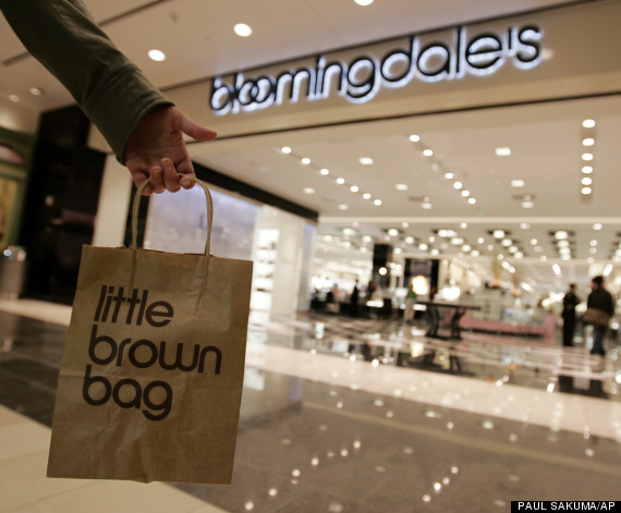
Ever noticed that malls smell like cinnamon sticks right around the holidays? Turns out that a pleasant smell can help get you to spend more -- and come back to spend again. Bloomingdale's intentionally has the smell of coconut in the swimwear section, Time reported in 2013, and stores like Hugo Boss turn to professional companies to provide signature scents for their brands.
6. Supermarkets put fruits and vegetables up front to coax you into buying junk food later
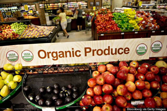
It's no coincidence that you begin your shopping experience in the produce section of virtually every supermarket. It's designed that way so you enter the store feeling good about your healthy purchases and don't feel as bad buying all those cookies, chips and bottles of soda later.
7. J.C. Penney jacked up prices so that it seemed like customers were getting a big sale discount
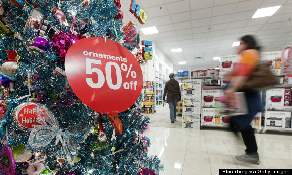
Last year, Reuters confirmed that J.C. Penney was using a strategy called "mark-up to mark down" to lure shoppers and boost sales. And yes, the tactic was exactly what it sounds like: The chain falsely inflated the prices of items and then lowered them through sales and discounts to make those "bargains" look just a little bit better.
8. Apple waits to send you receipts from iTunes downloads so that you don't feel bad about your impulse purchase of that new Iggy Azalea track
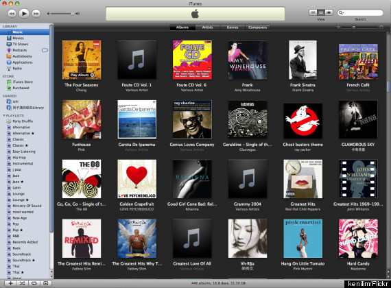
Ever immediately regret an impulse buy you make online? Apple reduces that guilt by simply delaying sending you receipts for an iTunes or App Store purchase by a couple hours or days, according to Wired. Sneaky!
9. Bars and restaurants won't include the dollar sign so you'll forget you're spending
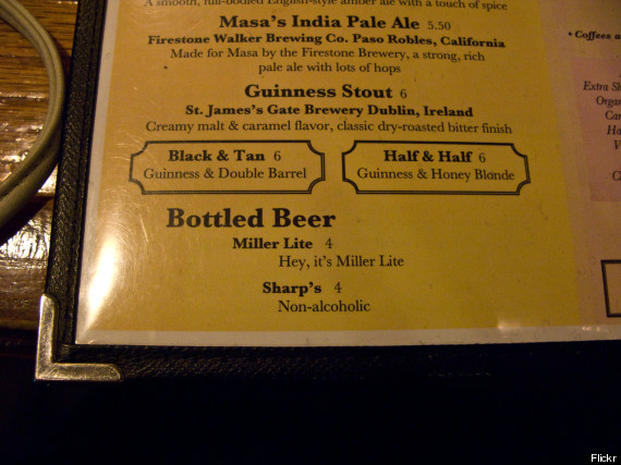
Research from Cornell's School of Hotel Administration found that people dining out spend more money when the price is not accompanied by a dollar sign in front of it.
10. Stores will hook you by letting you touch things before you buy

A 2010 study by economists at California Institute of Technology found that shoppers will pay up to 50 percent more for goods if they can touch them ahead of time. So while online shopping may be more convenient, you’ll fork over more money for something if you have direct contact with it in a traditional store.
11. Stores will play slow music to get you to linger inside and form emotional attachments with brands
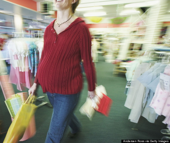
One Asian mall saw an uptick in purchases by pregnant women after it "started playing soothing music from the era when these women were born," marketing expert Martin Lindstrom wrote in his book Brandwashed: Tricks Companies Use to Manipulate Our Minds and Persuade Us to Buy. And, according to Lindstrom, the women said the mall's music continued to have a calming effect on their children even after they were born.
Another study in Scotland found that diners at a restaurant spent more money when slow music was playing, as opposed to fast music. This might be why Starbucks plays jazz and grocery stores play that slow elevator music.
12. Up-tempo songs encourage fast shopping and impulse buys

Meanwhile, playing fast, up-tempo music will make people go through stores quickly and make impulse buys, according to one study published in the European Journal of Scientific Research.