It's Election Day!
For American voters, it's a chance to decide which party controls the U.S. Congress.
For Spring Insight, it's a perfect opportunity to demonstrate what to do (and not do) to drive user behavior.
The dynamic of a midterm election is very different from that of a presidential election: voter turnout is typically low, with a smaller percentage of independent voters. The strategy is less about changing minds and more about getting the party faithful to the polls. The site reviews posted here were done on Monday, November 3, one day before election day. At this point in the campaign, it isn't about hearts and minds or contributions, it is about bodies in booths.
In other words, campaigns and their websites have ONE JOB: getting out the vote.
Let's take a look at how well two websites are doing that job in one extremely competitive, high-stakes campaign.
Republican Mitch McConnell of Kentucky -- the current Senate Minority Leader -- is hoping his party will take control of the Senate, making him one of the most powerful politicians in the country as Senate Majority Leader.
Meanwhile, feisty Democratic challenger and Kentucky Secretary of State Alison Lundergan Grimes is running a gloves-off campaign. Although most polls show her trailing, she claims momentum is on her side.
![2014-11-04-AlisonLunderganGrimesforU.S.SenateKentucky.jpg]()
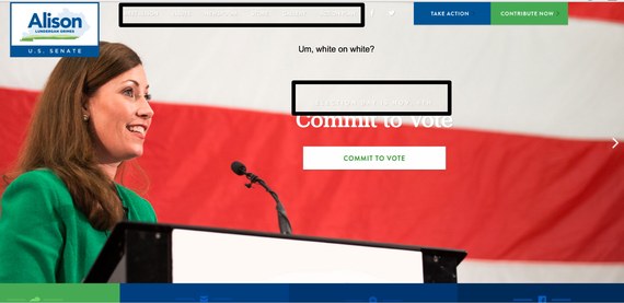
Grimes's home page has a revolving image as a background. Each image shows her in a "candidate as hero" pose in different settings. The first image I saw on arriving to the site has Alison standing alone at a podium in front of a stark, white backdrop. The image projects strength and determination, but it's undermined by a major blunder: white type against a white background. This use of white-on-white hides both the navigation and the most important words on the page: "Election Day is November 4."
Another way this site is failing the candidate is in the lack of fanfare over the fact that the election is one day away. Although I viewed this the day before the election, it could have been any old day in the election cycle.
And while there are call-to-action buttons inviting voters to meet the candidate, contribute funds, become a volunteer, like the page on Facebook, and "commit to" vote, nowhere does the page actually tell visitors to vote or help them find their polling place.
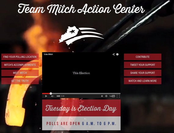
Moving on over to the Republican side, on the day before the election Team Mitch has directed incoming website traffic to a special election day splash page. The page opened up with a major turnoff: a video that automatically starts playing with a voice-over of the Senator.
![2014-11-04-TeamMitchElectionDayActionCenter.jpg]()
I don't care what you are running for; it's always a bad idea to take that level of control away from the site visitor (even if, unlike the senator, you don't sound like you are talking with a mouth full of split-pea soup.) It makes for a jarring user experience and a bad first impression. Picture the myriad of places a viewer of your website could be. Yes, she maybe alone in her office, but she also might be during a meeting in a conference room where starting audio unbidden will alert everyone she has stopped listening to her boss. (Bad, trust me.)
Once you've turned off the video, though, it's easy to find the call-to-action buttons. The most important one -- "Find Your Polling Location" -- is prominently located on the top left of the vertical navigation.
The remaining buttons are easy to find and make it convenient for visitors to donate to the campaign and promote the candidate on social media.
From the splash page, it's also easy to get to the full site. The full site is a single page scroll that looks flashy and expensive but is a bit of a mess from a strategic perspective. (That is a whole other post though.) As a side note, at the time this blog post was submitted (early on election date) the splash page had been changed to a less utilitarian page asking if I had voted.
Although both campaign sites have their flaws, McConnell's site the day before election day does the better job of getting the voters to the polls where, he hopes, they will vote for him. Based on this analysis, my prediction is that this Senate race goes to the Republican.
May the best candidate win.
For American voters, it's a chance to decide which party controls the U.S. Congress.
For Spring Insight, it's a perfect opportunity to demonstrate what to do (and not do) to drive user behavior.
The dynamic of a midterm election is very different from that of a presidential election: voter turnout is typically low, with a smaller percentage of independent voters. The strategy is less about changing minds and more about getting the party faithful to the polls. The site reviews posted here were done on Monday, November 3, one day before election day. At this point in the campaign, it isn't about hearts and minds or contributions, it is about bodies in booths.
In other words, campaigns and their websites have ONE JOB: getting out the vote.
Let's take a look at how well two websites are doing that job in one extremely competitive, high-stakes campaign.
Republican Mitch McConnell of Kentucky -- the current Senate Minority Leader -- is hoping his party will take control of the Senate, making him one of the most powerful politicians in the country as Senate Majority Leader.
Meanwhile, feisty Democratic challenger and Kentucky Secretary of State Alison Lundergan Grimes is running a gloves-off campaign. Although most polls show her trailing, she claims momentum is on her side.

Grimes's home page has a revolving image as a background. Each image shows her in a "candidate as hero" pose in different settings. The first image I saw on arriving to the site has Alison standing alone at a podium in front of a stark, white backdrop. The image projects strength and determination, but it's undermined by a major blunder: white type against a white background. This use of white-on-white hides both the navigation and the most important words on the page: "Election Day is November 4."
Another way this site is failing the candidate is in the lack of fanfare over the fact that the election is one day away. Although I viewed this the day before the election, it could have been any old day in the election cycle.
And while there are call-to-action buttons inviting voters to meet the candidate, contribute funds, become a volunteer, like the page on Facebook, and "commit to" vote, nowhere does the page actually tell visitors to vote or help them find their polling place.
Moving on over to the Republican side, on the day before the election Team Mitch has directed incoming website traffic to a special election day splash page. The page opened up with a major turnoff: a video that automatically starts playing with a voice-over of the Senator.

I don't care what you are running for; it's always a bad idea to take that level of control away from the site visitor (even if, unlike the senator, you don't sound like you are talking with a mouth full of split-pea soup.) It makes for a jarring user experience and a bad first impression. Picture the myriad of places a viewer of your website could be. Yes, she maybe alone in her office, but she also might be during a meeting in a conference room where starting audio unbidden will alert everyone she has stopped listening to her boss. (Bad, trust me.)
Once you've turned off the video, though, it's easy to find the call-to-action buttons. The most important one -- "Find Your Polling Location" -- is prominently located on the top left of the vertical navigation.
The remaining buttons are easy to find and make it convenient for visitors to donate to the campaign and promote the candidate on social media.
From the splash page, it's also easy to get to the full site. The full site is a single page scroll that looks flashy and expensive but is a bit of a mess from a strategic perspective. (That is a whole other post though.) As a side note, at the time this blog post was submitted (early on election date) the splash page had been changed to a less utilitarian page asking if I had voted.
Although both campaign sites have their flaws, McConnell's site the day before election day does the better job of getting the voters to the polls where, he hopes, they will vote for him. Based on this analysis, my prediction is that this Senate race goes to the Republican.
May the best candidate win.